This link has been bookmarked by 186 people . It was first bookmarked on 20 Nov 2014, by someone privately.
-
26 Nov 20

-
28 Jul 18
-
31 Dec 17
-
12 Sep 17
 T. Karhu
If a site element needs emphasis, apply both up-pop and down-pop styles. This will prevent things from being overwhelming, but allow different elements the visual weight they should have.
-
14 Feb 17
-
06 Feb 17
-
29 Jan 17
-
20 Oct 16
-
22 Mar 16
 Lun Esex
Useful design read and bookmark: 7 Rules for Creating Gorgeous UI (Part 2) by Erik D. Kennedy https://t.co/xOwrNES0UI
-
21 Mar 16
 Susan Kitchens
Useful design read and bookmark: 7 Rules for Creating Gorgeous UI (Part 2) by Erik D. Kennedy https://t.co/xOwrNES0UI
— Jeffrey Zeldman (@zeldman) March 21, 2016 -
23 Feb 16
-
28 Dec 15
-
09 Sep 15
 Chris Raymond
how to put text on images, successfully; gradients, scrims
design_principles visual_hierarchy ui-design scrim image-effects
-
08 Aug 15
-
12 Jul 15
-
28 Jun 15
-
30 Apr 15
-
17 Apr 15
-
05 Apr 15
-
26 Mar 15
-
05 Mar 15
-
26 Feb 15
-
23 Feb 15
-
Method 1: Overlay the whole image
-
Upstart website has a 35% opacity black filte
-
colored overlays
-
Floor fade
-
We’ll call those “up-pop” and “down-pop” styles, in honor of designers’ favorite adjective.
-
-
16 Feb 15
-
05 Feb 15
-
03 Feb 15
-
22 Jan 15
-
20 Jan 15
-
18 Jan 15
-
16 Jan 15
-
07 Jan 15
-
19 Dec 14
-
15 Dec 14
-
05 Dec 14
-
01 Dec 14
-
30 Nov 14
-
28 Nov 14
-
26 Nov 14
-
25 Nov 14
-
24 Nov 14
-
 michael chalk
good article about design
design UI erik.kennedy medium.com howto tips visual aesthetics article
-

-
23 Nov 14
-
22 Nov 14
-

-
 Micah Bales
This is the second part in a two-part series. You should read the first part first. We’re talking about rules for designing clean and simple UI without needing to attend art school in order to do so. via Pocket
-
21 Nov 14
-
 Caylee Farndon-Taylor
part two of instructions for great ui
-
 fraser smith
This is the second part in a two-part series. You should read the first part first. We’re talking about rules for designing clean and simple UI without needing to attend art school in order to do so. 7 Rules for Creating Gorgeous UI (Part 2) — Medium
-
-
-
 Shubham Dhamande
Rules for Creating Gorgeous UI, Part 2 https://t.co/7pcBuB5Zqg
-
-
Rule 4: Learn the methods of overlaying text on images
-
Rule 4: Learn the methods of overlaying text on images
-
-
-
-
-
Difficult to see, but definitely there, and definitely improving legibility.
-
Advanced move: mix the blur with the floor flade… introducing The Floor Blur.
-
Rule 5: Make text pop— and un-pop
Styling text to look beautiful and appropriate is often a matter of styling it in contrasting ways— for instance, larger but lighter.
-
- bigger or smaller)
- Color (greater contrast or lesser; bright colors draw the eye)
- Font weight (bolder or thinner)
- Capitalization (lowercase, UPPERCASE, and Title Case)
- Italicization
- Letter spacing (or— fancy term alert— tracking!)
- Margins (technically not a property of the text itself, but can be used to draw attention, so it makes the list)
-
Up-pop and down-pop
-
-
Page titles are the only element to style all-out up-pop.
For everything else, you need up- and down-pop -
Page titles are the only element to style all-out up-pop.
For everything else, you need up- and down-pop. -
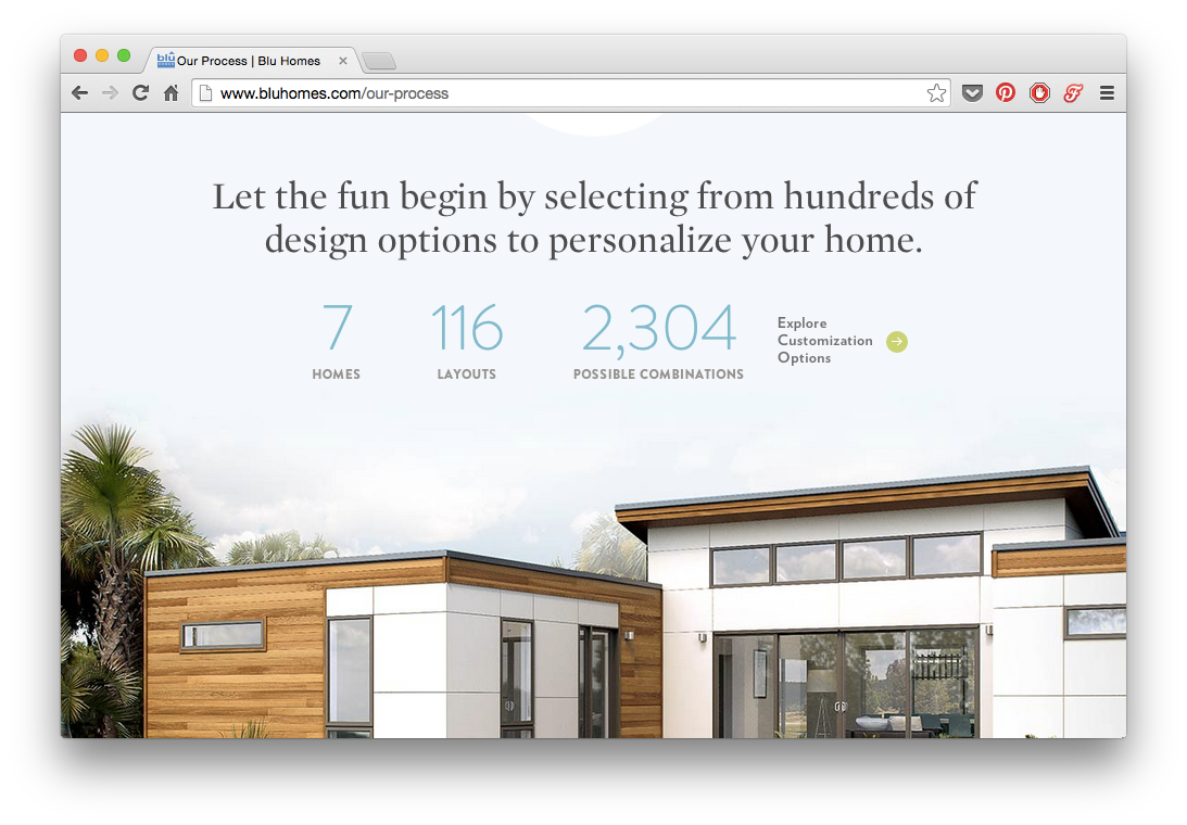
The impeccably-designed Blu Homes website has some big titles, but the emphasized word is lowercase— too much emphasis would look overpowering.
-
-
The small labels below the numbers, however, while gray and small, are also uppercase and very bold.
-
Open Sans (above). An easy-to-read, popular font. Good for body copy.
-
I’m a firm believer that every artist should be a parrot until they’re good at mimicking the best. Then go find your own style; invent the new trends.
-
-
20 Nov 14


Would you like to comment?
Join Diigo for a free account, or sign in if you are already a member.