spatial cognition

Jencis's List: Reading On Screen
-
-
When it comes to reading long form, the web can be an ugly, distracting place. It’s the reason why services like Instapaper and Pocket (née Read It Later) exist: to strip content of its context — noisy site designs, advertisements, and other unnecessary elements. But perhaps we’re moving into a new era where more of the web is clean and readable. Maybe the future of web publications will be beautiful enough that the reading experience is more enjoyable in its natural habitat.
-
The piece is generously adorned with accompanying visuals — photos of Ellis, memorabilia like trading cards, pull quotes, all moving and sliding while the reader scrolls. The reading experience is very comfortable on both desktop and tablet, thanks to a larger text size and generous amounts of white space. It feels like an experience instead of a block of words surrounded by the detritus of the web.
-
-
Oct 11, 14
-
As is pointed out in the app, the problem with the web is not that it’s full of fluff. It’s that, done right, there’s too much that is smart and interesting. The question is how to hold on to any of it.
-
So Sloan turns to his central metaphor: fish. It stems from the story of historian Louis Agissiz. He would put students in a room with a fish on a metal tray and tell them to look at it, for hours on end. Though they would become exasperated, he would send them back again, and tell them to keep looking–at which point they would then start to uncover a startling plethora of details. The idea is both simple and profound: when we return to something repeatedly, we discover anew. We rarely return to anything online. So: an iPhone essay called “Fish”.
-
-
Oct 11, 14
-
Even so, evidence from laboratory experiments, polls and consumer reports indicates that modern screens and e-readers fail to adequately recreate certain tactile experiences of reading on paper that many people miss and, more importantly, prevent people from navigating long texts in an intuitive and satisfying way. In turn, such navigational difficulties may subtly inhibit reading comprehension. Compared with paper, screens may also drain more of our mental resources while we are reading and make it a little harder to remember what we read when we are done. A parallel line of research focuses on people's attitudes toward different kinds of media. Whether they realize it or not, many people approach computers and tablets with a state of mind less conducive to learning than the one they bring to paper.
-
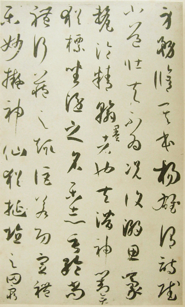
Especially intricate characters—such as Chinese hanzi and Japanese kanji—activate motor regions in the brain involved in forming those characters on paper: The brain literally goes through the motions of writing when reading, even if the hands are empty. Researchers recently discovered that the same thing happens in a milder way when some people read cursive.
-
-
-
Anne Mangen of Norway's Stavanger University, a lead researcher on the study, thought academics might "find differences in the immersion facilitated by the device, in emotional responses" to the story. Her predictions were based on an earlier study comparing reading an upsetting short story on paper and on iPad. "In this study, we found that paper readers did report higher on measures having to do with empathy and transportation and immersion, and narrative coherence, than iPad readers," said Mangen.
But instead, the performance was largely similar, except when it came to the timing of events in the story. "The Kindle readers performed significantly worse on the plot reconstruction measure, ie, when they were asked to place 14 events in the correct order
-
sense of time and sequence is what is affected
-
-
She is now chairing a new European research network doing empirical research on the effects of digitisation on text reading. The network says that "research shows that the amount of time spent reading long-form texts is in decline, and due to digitisation, reading is becoming more intermittent and fragmented", with "empirical evidence indicat[ing] that affordances of screen devices might negatively impact cognitive and emotional aspects of reading". They hope their work will improve scientific understanding of the implications of digitisation, thus helping to cope with its impact.
-
-
-
- First, convince users that the site is worthy of their attention. As I described above, this means having good information and making it easy to find.
- Second, once they arrive, make it easy for users to find even more good stuff so that they stay rather than go elsewhere. An entire movement was devoted to the idea of sticky sites and extended visits.
Moving between sites has always been easy. But, from an information foraging perspective, it used to be best if users stayed put because the vast majority of websites were horrible and the probability that the next site would be any good was extremely low. I thus advised early website designers to follow two design strategies:
In the last few years, Google has reversed this equation by emphasizing quality in its sorting of search results. It is now extremely easy for users to find other good sites.
-
information snacking
-
-
-
Information scent refers to the extent to which users can predict what they will find if they pursue a certain path through a website. The term is part of information foraging theory, which explains how users interact with systems using the analogy of animals hunting for food.
-
-
-
- Good information architecture (IA), with clear navigation that allows users to quickly get to a page that's relevant to their interest. If users are bogged down by slow or misleading navigation, their interest peters out — as does their motivation to read much once they finally arrive on the desired page. Furthermore, each page should be clearly signposted, with a good heading and other design elements that signal that this is indeed the page users need.
- Good page layout that quickly guides the eye to the relevant part of the page, utilizing well-written subheads to summarize the information in each segment (as in the zoo example).
It's good that the user could focus her attention on the information of interest and ignore the rest. When we see people read on websites, it's usually because the site meets two usability goals:
-
-
-
Summary: Users often see online content out of context and read it with different goals than you envisioned. While you can't predict all such goals, you can plan for multiple uses of your text.
-
or old media, reader goals are well known, ranging from being entertained (when reading a mystery novel) to getting investment ideas (when reading the Wall St. Journal 's "Markets" section).
-
-
-
- Users first read in a horizontal movement, usually across the upper part of the content area. This initial element forms the F's top bar.
- Next, users move down the page a bit and then read across in a second horizontal movement that typically covers a shorter area than the previous movement. This additional element forms the F's lower bar.
- Finally, users scan the content's left side in a vertical movement. Sometimes this is a fairly slow and systematic scan that appears as a solid stripe on an eyetracking heatmap. Other times users move faster, creating a spottier heatmap. This last element forms the F's stem.
232 users looked at thousands of Web pages. We found that users' main reading behavior was fairly consistent across many different sites and tasks. This dominant reading pattern looks somewhat like an F and has the following three components:
-
Start subheads, paragraphs, and bullet points with information-carrying words that users will notice when scanning down the left side of your content in the final stem of their F-behavior. They'll read the third word on a line much less often than the first two words.
-
-
-
- Users can see less at any given time. Thus, users must rely on their highly fallible memory when trying to understand anything that's not fully explained within the viewable space.
- Less context = less understanding
- Users must move around the page more, using scrolling to refer to other parts of the content instead of simply glancing at the text. Scrolling introduces 3 problems:
- It takes more time, thus degrading memory.
- It diverts attention from the problem at hand to the secondary task of locating the required part of the page.
- It introduces the new problem of reacquiring the previous location on the page.
A smaller screen hurts comprehension for two reasons:
- Users can see less at any given time. Thus, users must rely on their highly fallible memory when trying to understand anything that's not fully explained within the viewable space.
-
-
-
Typically, usability findings are stable across many years: 80% of Web usability guidelines from the 1990s are still in force.
Today, users will scroll. However, you shouldn't ignore the fold and create endless pages for two reasons:
-
Scrolling beats paging because it's easier for users to simply keep going down the page than it is to decide whether or not to click through for the next page of a fragmented article. (Saying that scrolling is easier obviously assumes a design that follows the guidelines for scrollbars and such.)
-
-
-
If everything said above sounds too easy and you’re looking for a challenge, another option is to code your EPUB by hand. This feels like programming in a time warp. EPUB is built on such an outdated version of XHTML that half the time you’ll be reminding yourself that everything in the EPUB must be declared in the manifest file (really?), while the other half of the time you’ll be recalling how you used to program HTML in the ’90s.
-
-
-
t 79 percent of our test users always scanned any new page they came across; only 16 percent read word-by-word.
-
- highlighted keywords (hypertext links serve as one form of highlighting; typeface variations and color are others)
- meaningful sub-headings (not "clever" ones)
- bulleted lists
- one idea per paragraph (users will skip over any additional ideas if they are not caught by the first few words in the paragraph)
- the inverted pyramid style, starting with the conclusion
- half the word count (or less) than conventional writing
Web pages have to employ scannable text, using
-
-
-
- Encouraging reading through web formatting techniques
- Writing styles that improve comprehension
- Using headings, subheadings, and page priority — how to get these right
- Information-bearing words in links and leading sentences, and their positive effect on usability and scanning
- Eye-catching text elements such as capital letters and bulleted lists can create interest. People looked at 29% of words that appear in all capital letters. People look at lists with bullets more often than lists without bullets (70% vs. 55%, respectively).
- Writing for people with low literacy
- Fixed vs. liquid layout, and column width: The positives and negatives as they relate to scan patterns
- Miscues that entice users to spend fixations on them at the wrong time and for the wrong reasons
- Table layout for easiest data consumption
- Dealing with complex content
- Plan for scanning behaviors
- Exhaustive review: People look extensively and repeatedly at an area or page because they expect the information
- Encouraging reading through web formatting techniques
-
300 people aged 18 to 64 years. The method we used is Eyetracking, in which we followed people’s eye movement as they attempted activities on websites.
-
-
-
30% viewing the right half.
-
69% of their time viewing the left half of the page
-
1 - 15 of 15
20 items/page
List Comments
(0)
List Info

15 items | 2 visits