This link has been bookmarked by 28 people . It was first bookmarked on 03 Apr 2007, by Bill Stocking.
-
18 Feb 10
-
18 Dec 09
 Peter Ingersoll
can create a confusing visual layout, which is bad for all users, but may be especially difficult for users w
-
21 Oct 09

-
Two tags in HTML create a bold text appearance, the
<b>tag and the<strong>tag. The<b>tag has no semantic meaning. The<strong>tag means "strong emphasis." If the purpose in using bold text is to emphasize something, the<strong>tag is more appropriate. If the purpose is to simply have fatter text, the<b>would work, except that it is deprecated, meaning there is a newer, better way of achieving the same effect. This newer better way is Cascading Style Sheets (CSS). The markup for creating bold text using CSS isfont-weight:bold. Considering that most authors use bold fonts to emphasize words or phrases, the<strong>tag should be used, rather than the CSS style. -
Limit the use of font variations such as bold, italics, and ALL CAPITAL LETTERS.
-
Keep in mind that documents with only one, or only a few font faces are usually easier to read. Using too many font faces can create a confusing visual layout, which is bad for all users, but may be especially difficult for users with reading disorders, learning disabilities, or attention deficit disorders.
-
Some fonts, such as Verdana, Tahoma, Trebuchet MS, and Georgia, were developed specifically for use in electronic media, and are now quite common on both Windows and Mac platforms, especially if Microsoft Word is installed on the computer
-
Verdana is one of the most popular of the fonts designed for on-screen viewing. It has a simple, straightforward design, and the characters or glyphs are not easily confused. For example, the upper-case "I" and the lower-case "L" have unique shapes, unlike Arial, in which the two glyphs may be easily confused.
-
(see the Web Style Guide - external link by Patrick Lynch and Sarah Horton).
-
Georgia is like the other web fonts discussed so far in that it is wider than similar fonts meant for print design. Unlike the other web fonts, though, Georgia is a serif font, more along the lines of Times New Roman.
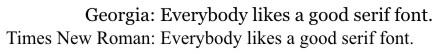
Georgia is somewhat easier on the eyes than Times New Roman, although high resolution screens with font smoothing technology also display Times New Roman quite well.
-
Algorithms exist to help developers determine whether there is sufficient contrast between the foreground and the background. The first algorithm is for brightness, and the second algorithm is for color difference. The algorithms use the red green blue (RGB) color values common in web development. A color with an RGB value of #000000, for example, has no amount of any color. This is black. Colors are defined by a combination of letters and numbers, which makes the system a bit difficult to understand. White, for example is #FFFFFF. Understanding the system is not necessary, though, since there are tools to determine proper color contrast, such as the Juicy Studio Colour Contrast Analyser - external link. The algorithms are listed here for those who are curious.
-
-
09 Jul 09
-
17 Apr 09

-
24 Feb 09
-
31 Jan 09

-
15 Sep 08
 Heather Ebey
Discussion of font and font-family typefaces used in web design, support on various platforms (Mac vs. PC vs. Linux), readability on screen
-
25 Apr 08
-
Fonts are the style of "type face" used to display text, numbers, characters and other "glyphs" as they are often called in the typography industry.
-
- Arial,
- Book Antiqua,
- Comic Sans MS,
- Georgia,
- Courier New,
- Tahoma,
- Times New Roman,
- Trebuchet MS, and
- Verdana.
fonts relatively common to recent versions of the Windows and Mac operating systems, such as:

-
Font families
-
- serif,
- sans-serif,
- cursive,
- fantasy, and
- monospace.
-
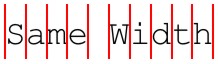
Serif fonts
Serif fonts are characterized by the flared extensions, or strokes, on the tips of such letters as f, l, and i, as seen in the screen shot below:

-
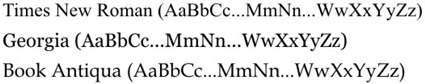
Examples of serif fonts include Times New Roman, Georgia, and Book Antiqua.

-
-
Georgia
Georgia is like the other web fonts discussed so far in that it is wider than similar fonts meant for print design. Unlike the other web fonts, though, Georgia is a serif font, more along the lines of Times New Roman
-
This is still a rather popular web font because it "has some style," so to speak. It is unique and has an artistic feel to it, but is still readable for the most part. In terms of accessibility, it is better than some fonts, but not as good as others.
-
Trebuchet MS
Trebuchet is an attractive font, but it has subtle curved embellishments that may decrease overall readability for long passages of text.
-
Tahoma is still an acceptable font, but is probably somewhat less readable overall than Verdana or Arial/Helvetica for long passages of text.
-
Tahoma
Tahoma is another alternative to the Arial/Helvetica style of font.
-
The words take up more space than words in Arial, even at the same point size
-
Sans-serif fonts
Sans-serif fonts have plain endings, and appear blockier than serif fonts. They do not have the flared extensions, strokes, or other kinds of ornamentation. ("Sans" means without, and "serif" refers to the extra strokes, or lines.)

-
Common monospace fonts are Courier and Courier New
-
-
Monospace fonts get their name from the fact that each letter takes up the same width of space
-
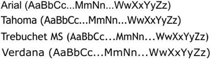
Sans-serif fonts include Arial, Tahoma, Trebuchet MS, and Verdana.
-
-
Verdana is one of the most popular of the fonts designed for on-screen viewing. It has a simple, straightforward design, and the characters or glyphs are not easily confused. For example, the upper-case "I" and the lower-case "L" have unique shapes, unlike Arial, in which the two glyphs may be easily confused.
-
-
27 Mar 08
-
19 Feb 08
-
12 Nov 07
-
09 Oct 07
-
03 Apr 07


Would you like to comment?
Join Diigo for a free account, or sign in if you are already a member.