
This link has been bookmarked by 82 people . It was first bookmarked on 20 Mar 2006, by Sérgio Carvalho.
-
21 Jul 09
 Simone Economo
"Layout seems to be a hot topic at the moment, mostly prompted by the ALA redesign and the numerous discussions of the choice by Jason and the ALA team to go 1024 for a fixed width. I'm not going to go into my thoughts on ALA in too much depth here, there
design grid system webdesign layout css ratio measurement canvas modular gutter for:patrick91it for:ukinomao for:silvernightwolf for:dreamquest
-
18 May 09
-
10 Apr 09
-
26 Mar 09
-
designing to strong grids means you have to take a step back from what you think the design should look like
-
-
10 Mar 09
-
08 Jan 09
-
15 Dec 08
-
29 Aug 08

-
24 Aug 08
-
02 Aug 08
-
13 Mar 08
-
12 Mar 08
-
05 Mar 08
-
26 Feb 08
-
23 Feb 08
-
18 Feb 08
-
19 Jan 08
-
So, fixed width grid design for the web. What is it, how do we do it and how do we implement it?
-
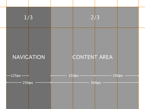
The designer is using fixed measurements, pixels mostly, to construct the grid and to position elements within the grid structure and a canvas which is based on a fixed size.
-
he canvas size for fixed grid design on the web is normally determined by the browser window size, which is in turn determined by the user's screen resolution. These are not fixed.
-
novice users, particularly on a PC, run a browser at full screen because that is the default, whereas on a Mac the default isn't full screen
-
I've designed to a base minimum (based on 800 x 600) of 760px x 410px (410px being the fold)
-
vertical measurement is also important, but this is where we can run into problems with designing even fixed grid systems on the web.
-
ser's change the type size, elements move vertically (if we've fixed the horizontal widths).
-
Gutters are the gaps in between columns.
-
This creates practical problems for us when designing grid systems on the web because of the way we create the columns.
-
umns we create, using Web Standards, are 'divs' which are given widths and positioned and styled using CSS.
-
deal with gutters as part of columns and they are implemented using padding, or creating margins, on elements positioned within them, or sometimes the column divs themselves.
-
in order for the grid to work you must consistently align items on the grid lines.
-
First of all I take great care in drawing the grid accurately, to the pixel, and then I overlay content elements ensuring the alignment is precise.
-
o summarise: Using the grid I designed in photoshop, I save it out as a gif and then apply that to the background of the body tag. This provides me, throughout the build of the site, the grid so I can align all the content elements accordingly.
-
has pioneered a technique for producing flexible column layouts using CSS and controlling them by giving a class to the body tag
-
-
08 Dec 07
-
20 Nov 07
-
08 Oct 07
-
27 Sep 07
 FirstN@me L@stN@me
Mark Boulton is a designer based in Cardiff, UK. Specialising in usable, functional and elegant design acquired through rigorous problem solving.
-
03 Jul 07
-
For many years I've designed to a base minimum (based on 800 x 600) of 760px x 410px (410px being the fold).
-
he example I'm using for this tutorial is my own site, which uses a fixed grid and sits happily below 760px wide.
-
-
-
05 Jun 07

-
03 Jun 07
-
28 May 07
-
01 May 07
-
24 Apr 07
-
13 Apr 07
-
10 Apr 07
-
09 Apr 07
-
01 Jan 07

-
21 Nov 06
-
22 Aug 06
-
09 Aug 06
-
20 Mar 06
-
11 Feb 06
-
25 Jan 06
-
06 Oct 05
-
09 Sep 05
-
02 Sep 05
-
01 Sep 05
-
31 Aug 05
-
30 Aug 05


Would you like to comment?
Join Diigo for a free account, or sign in if you are already a member.